We can FINALLY animate gradients with CSS!

Gradients are commonly used in web design to create smooth color transitions and add visual appeal to elements. The ability to animate gradients using CSS variables can provide even more flexibility and dynamic effects. In this blog post, we will delve into the concept of animating gradients with CSS variables and showcase some examples.
Gradients have long been a powerful tool in CSS for creating beautiful color transitions. However, until recently, animating gradients directly was a challenge. Enter the @property rule in CSS, which introduces the ability to define the type of CSS variables, including color variables. With this new capability, we can animate variables from one color to another and apply them to gradients. In this blog post, we will explore how to animate gradients using CSS variables and unlock a world of creative possibilities.
You can create a new Next.js project interactively by running the below command:
yarn create next-app
You will then be asked the following prompts:
What is your project named?  my-app
Would you like to use TypeScript with this project?  No / Yes
Would you like to use ESLint with this project?  No / Yes
Would you like to use Tailwind CSS with this project?  No / Yes
Would you like to use `src/` directory with this project?  No / Yes
Use App Router (recommended)?  No / Yes
Would you like to customize the default import alias?  No / Yes
Just select options according to the below image.

1. Overwrite your global.css file with the below CSS:
@tailwind base;
@tailwind components;
@tailwind utilities;

@layer base {
  @property --color-a {
    syntax: "<color>";
    inherits: true;
    initial-value: transparent;
  }
  @property --color-b {
    syntax: "<color>";
    inherits: true;
    initial-value: transparent;
  }
  @property --color-c {
    syntax: "<color>";
    inherits: true;
    initial-value: transparent;
  }
}

@layer components {
  .range {
    appearance: none;
    width: 100%;
    background: white;
    height: 2px;
  }
  .range::-webkit-slider-thumb {
    appearance: none;
    background: var(--color-b);
    border: 2px solid white;
    width: 36px;
    height: 36px;
    border-radius: 36px;
    cursor: pointer;
  }
  .range::-moz-range-thumb {
    appearance: none;
    background: var(--color-b);
    border: 2px solid white;
    width: 36px;
    height: 36px;
    border-radius: 36px;
    cursor: pointer;
  }
}
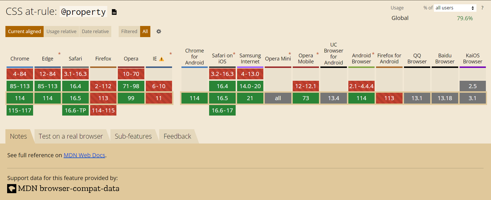
Read more about @property - MDN Docs
2. Then Add the below in your tailwind.config.js
/** @type {import('tailwindcss').Config} */
module.exports = {
  content: [
    './pages/**/*.{js,ts,jsx,tsx,mdx}',
    './components/**/*.{js,ts,jsx,tsx,mdx}',
    './app/**/*.{js,ts,jsx,tsx,mdx}',
  ],
  theme: {
    extend: {
      backgroundImage: {
        'gradient-radial': 'radial-gradient(var(--tw-gradient-stops))',
        'gradient-conic':
          'conic-gradient(from 180deg at 50% 50%, var(--tw-gradient-stops))',
      },
      keyframes: {
        blob: {
          "0%": {
            translate: "0 0",
            rotate: "0deg",
          },
          "30%": {
            rotate: "40deg",
          },
          "50%": {
            transform: "translate(300px, 390px) scale(1.1)",
          },
          "80%": {
            rotate: "90%",
          },
        },
      },
      animation: {
        blob: "blob 8s infinite cubic-bezier(0.6, -0.28, 0.735, 0.045)",
        "blob-reverse":
          "blob 10s infinite cubic-bezier(0.215, 0.61, 0.355, 1) reverse",
      },
    },
  },
  plugins: [],
}
3. We have all our CSS and Animations ready.
Now go to index.tsx file and copy it below:
import { useEffect, useRef, useState } from "react";

enum Feeling {
  Sad = 1,
  Neutral = 2,
  Happy = 3,
}

const feelingColorMap = {
  [Feeling.Sad]: ["#394e7a", "    #8e9ac7", "#4ee"],
  [Feeling.Neutral]: ["#22d", "#c8f8ff", "#6d2"],
  [Feeling.Happy]: ["#39f", "#f4e54d", "#fa3"],
};

const feelingLabelMap = {
  [Feeling.Sad]: "Could be better",
  [Feeling.Neutral]: "Okay",
  [Feeling.Happy]: "Happy",
};

export default function Home() {
  const wrapperRef = useRef<HTMLDivElement | null>(null);
  const [feeling, setFeeling] = useState<Feeling>(Feeling.Neutral);

  useEffect(() => {
    if (!wrapperRef.current) return;

    const [a, b, c] = feelingColorMap[feeling];

    wrapperRef.current.style.setProperty("--color-a", a);
    wrapperRef.current.style.setProperty("--color-b", b);
    wrapperRef.current.style.setProperty("--color-c", c);
  }, [feeling]);

  return (
    <main className="flex min-h-[100dvh] w-full items-center justify-center">
      <div
        ref={wrapperRef}
        className="relative mx-auto aspect-[9/16] w-[360px] max-w-full overflow-hidden rounded-2xl bg-gradient-to-br from-[--color-a] via-[--color-b] to-[--color-c] p-8 text-white duration-500 ease-in [transition-property:_--color-a,_--color-b,_--color-c] before:absolute before:left-[20%] before:top-[10%] before:h-[50%] before:w-[70%] before:origin-[60%] before:animate-blob before:rounded-3xl before:bg-gradient-to-br before:from-[--color-a] before:to-[--color-b] before:blur-[50px] before:brightness-125 after:absolute after:left-[40%] after:top-[30%] after:h-[80%] after:w-[70%] after:origin-[60%] after:animate-blob-reverse after:rounded-3xl after:bg-gradient-to-br after:from-[--color-a] after:to-[--color-b] after:blur-[50px] after:brightness-125"
      >
        <div className="relative z-10">
          <h1 className="mb-12 text-5xl font-medium leading-tight">
            How are you feeling today?
          </h1>

          <h2 className="mb-4 text-center text-2xl font-medium">
            {feelingLabelMap[feeling]}
          </h2>

          <input
            className="range"
            onChange={(ev) => setFeeling(ev.target.value as unknown as Feeling)}
            type="range"
            min={1}
            value={feeling}
            max={3}
            step={1}
          />
        </div>
      </div>
    </main>
  );
}
And voila! Behold the mesmerizing animation of our gradient.
Check out the resulting output here - https://moving-gradients.vercel.app/
This design and example are inspired by dribble and frontend.fyi with ❤️